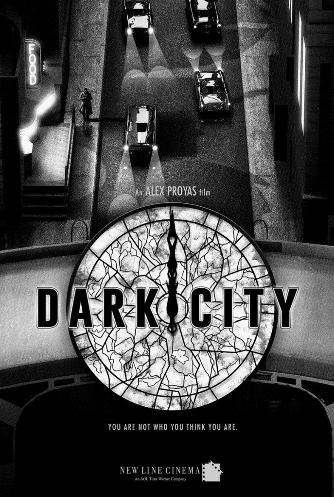
“You are not who you think you are…”
In 1998 Writer/ Director Alex Proyas released a sensational sci-fi thriller called, “Dark City.” Based on a screenplay which was written by Proyas, Lem Dobbs and David S. Goyer it tells the story of John Murdock. Accused of murder, but suffering from amnesia, Murdock seeks out the answers to his dilemma before the police and a dark group of individuals known as “The Strangers” can catch up to him. The film stars Rufus Sewell, Jennifer Connelly, Kiefer Sutherland, Richard O’Brien, Ian Richardson along with William Hurt and is a true cult classic.
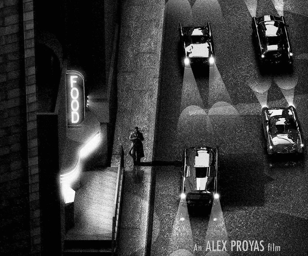
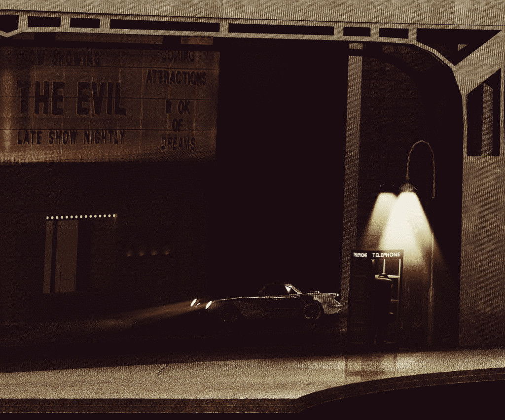
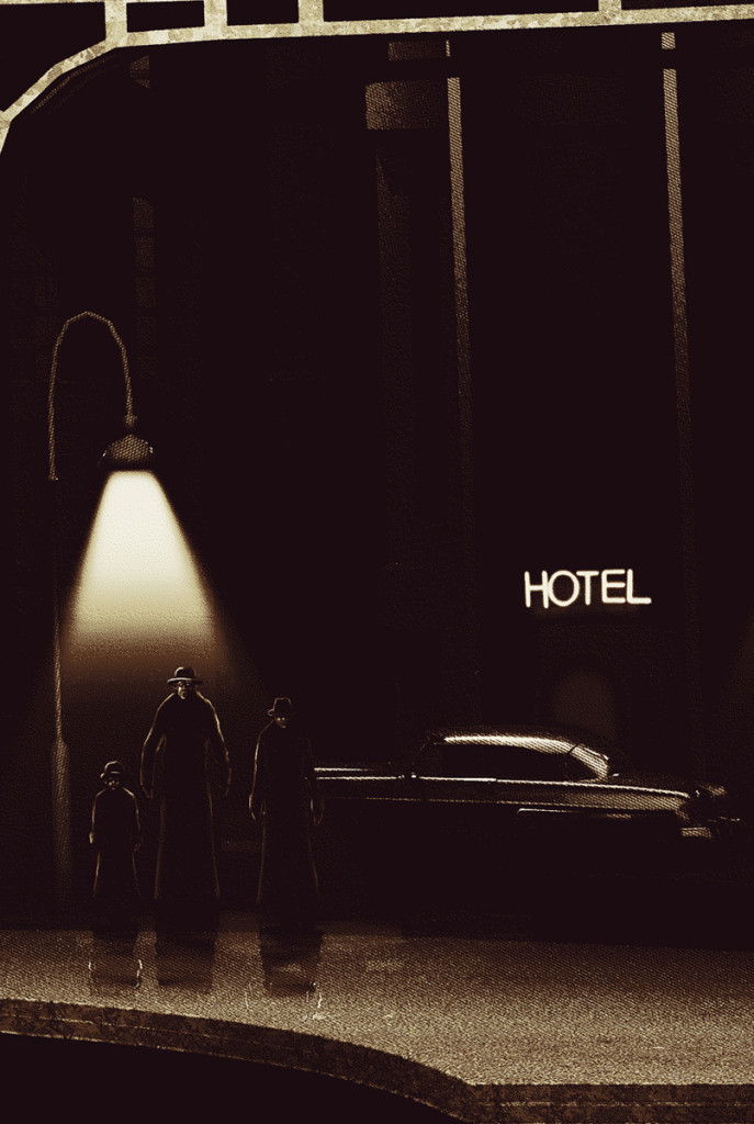
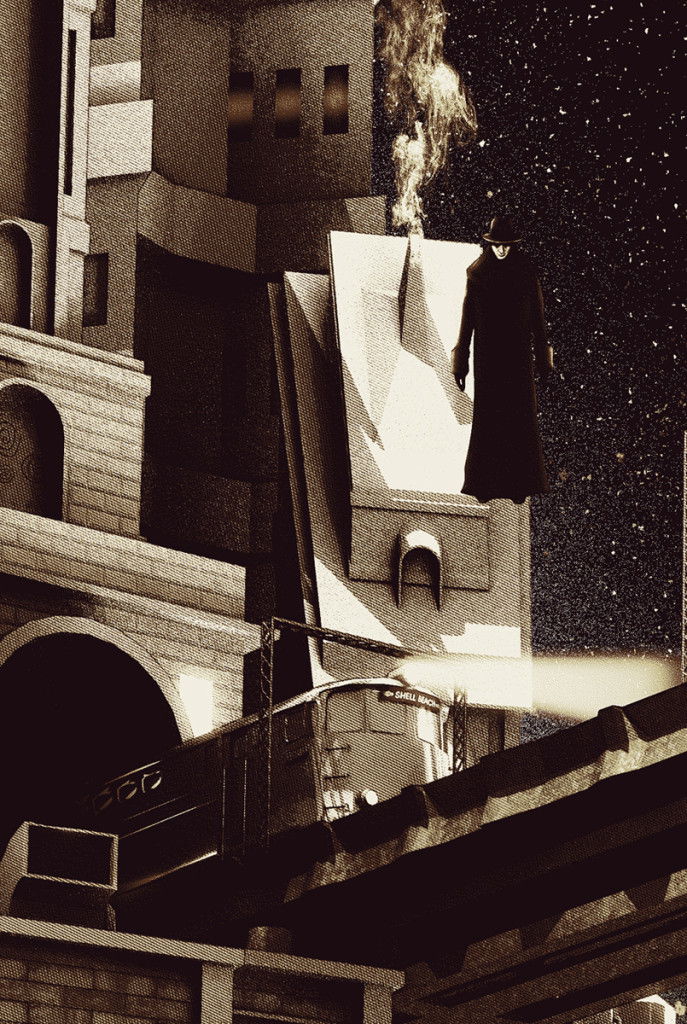
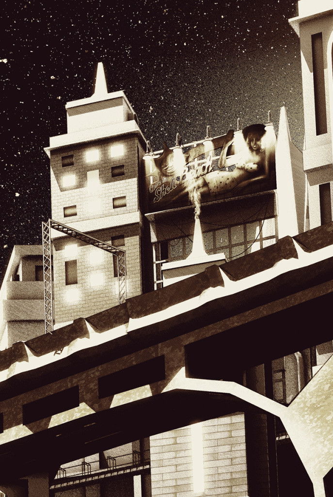
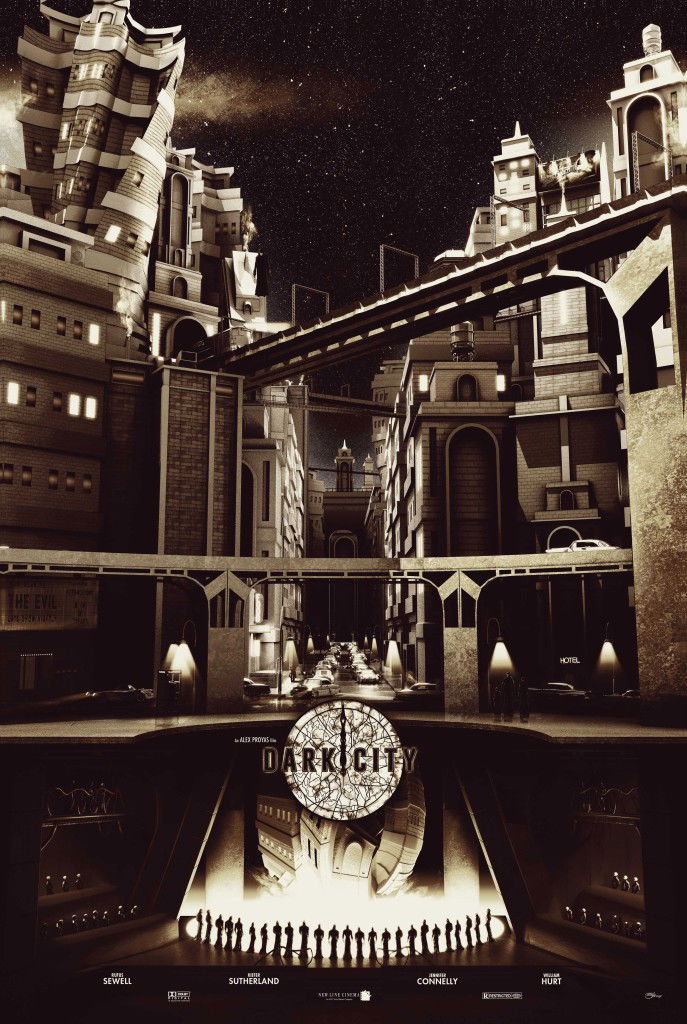
Recently, Chris Skinner was approached to pay homage to the film by coming up with a unique print(s) for a private commission group. Here is a look at his work along with what he had to say about the project. (We loved this so much that after seeing it, we went back and watch the film again.)
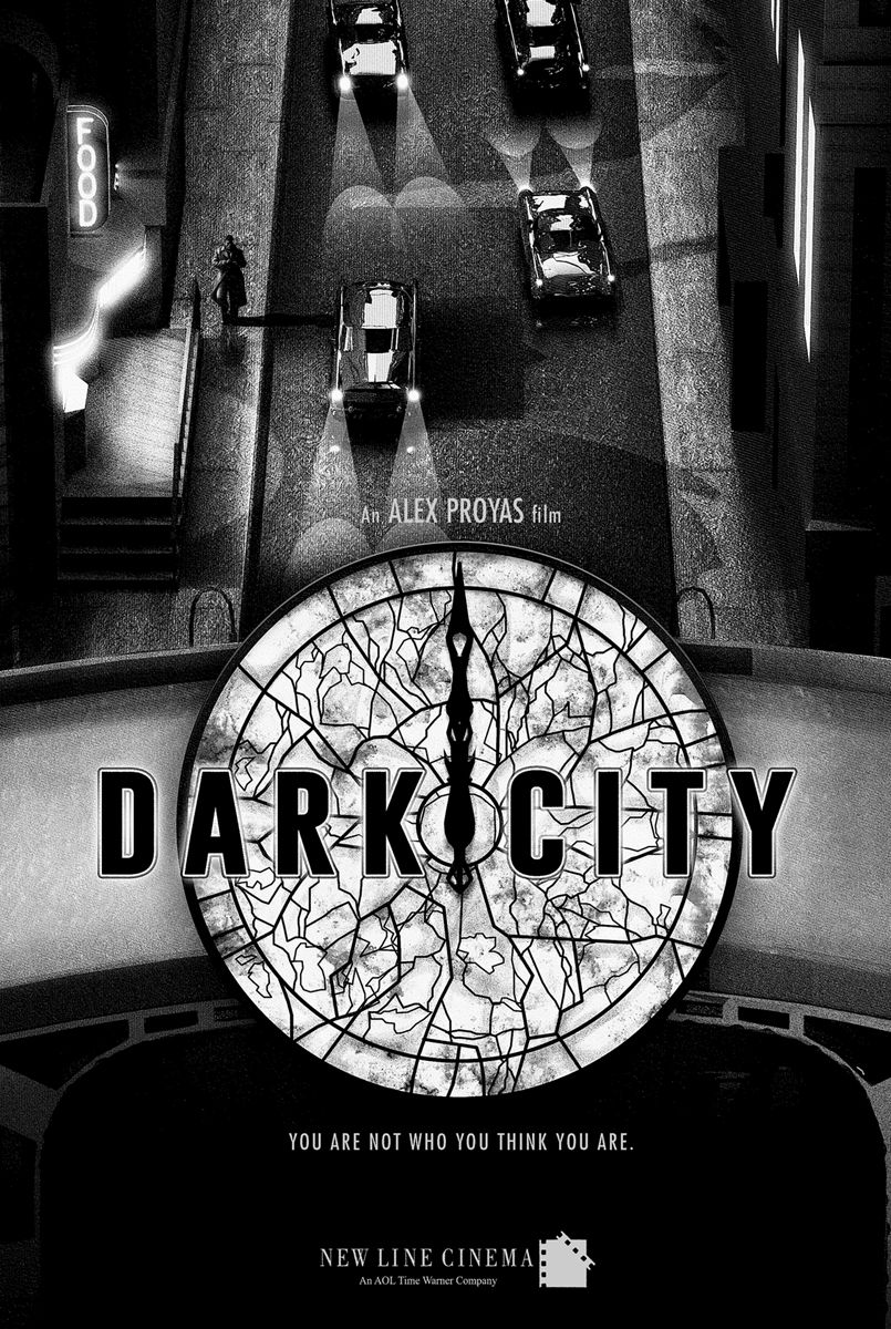
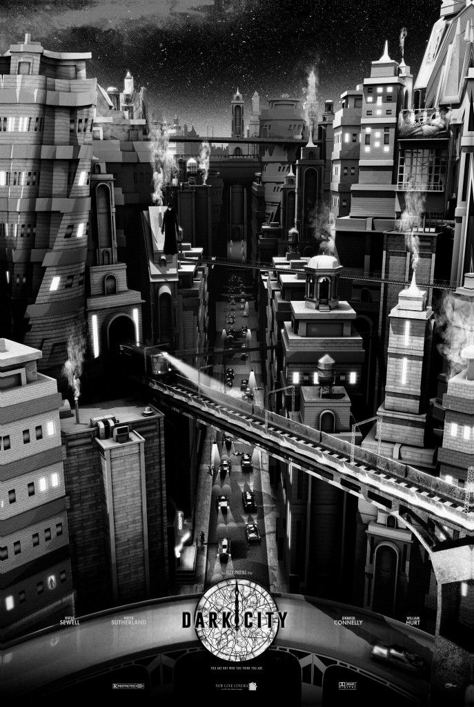
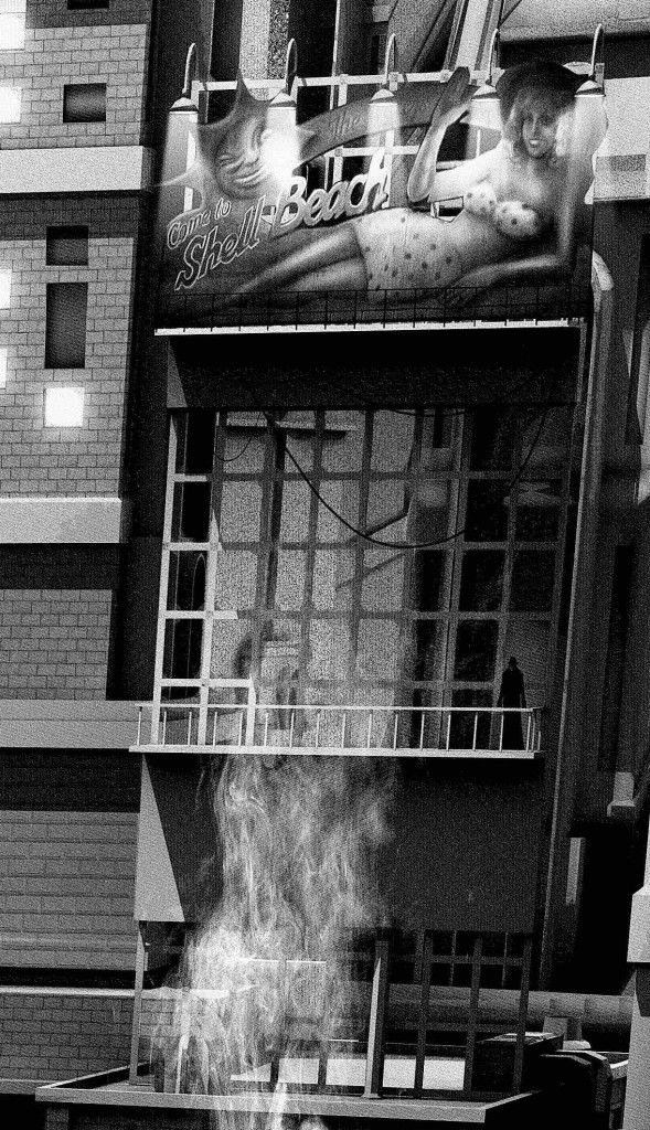
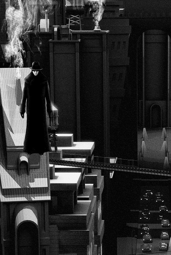
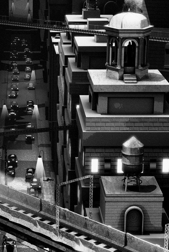
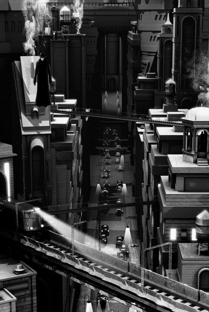
When I was approached to work on this commission I instantly knew it would be a great project to work on, and even though I couldn’t really remember the full story as the last time I watched it was back in 1998 I knew it was visually rich and had a great gothic, retro, sci-fi style to it. Rather than focus on any of the characters for the print we decided to make the city the main element, which if you’ve seen the film will know it has a lot of movement and character hence some of the buildings twisting in the prints. There are various Easter eggs in the artwork which fans should be able to instantly point out, the commissioner had some great ideas for this project and hopefully those details have made this a print for fans of the film. Talking of the film, if you haven’t seen it yet make sure you watch the Director’s cut, if you have seen the theatrical release now go and watch the Director’s cut.
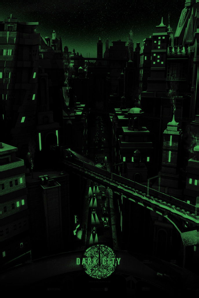
Skyscape Edition of 100 with Metallic and Glow in the Dark Ink
– Metallic ink on all metals within the print, cars, train, bridges and to represent the wet roads.
– Glow in the dark ink highlighting light sources within the image and the clock.
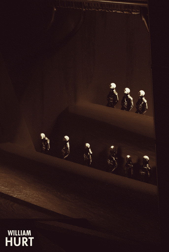
– Strangers and swirls hidden throughout the city.
We were also able to get a few words from the commissioner of these stellar prints. Here is what he had to say along with a close look at the variant edition.
“Dark City, in particular the directors cut, is just one of those movies that once you’ve seen it you’ll not forget it. It’s an underrated cult classic and a true sci fi gem that brings to mind classics such as Metropolis, The Maltese Falcon, The Twilight Zone and China Town, a true film noir in a sci fi universe.
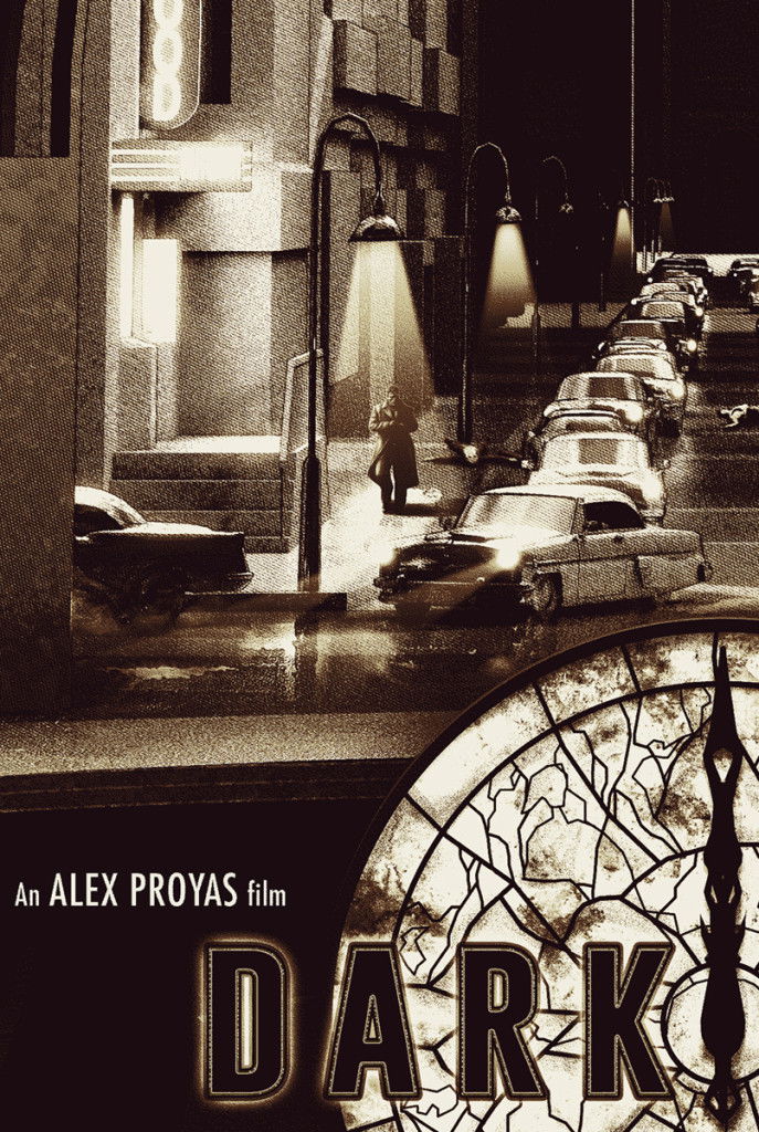
I had this concept floating around in my head for years before deciding to do something about it, and through seeing Chris’ Star Wars Viewpoints set he created for Hero Complex Gallery I knew I’d found the perfect match to bring it to life and onto paper. We talked at length about how to get the depth we were after so the viewer could get lost in the print, and then, through the first draft of the concept it was evident the variant could become a whole new print in it’s own right, so instead of being just a colour change we opted to completely change the angle/view of the print to show the epic scale and grandness of the city. The city in Dark City, is almost a character itself within the movie, so we really wanted to show off the visuals Director Alex Proyas, Production Designer Patrick Tatopoulos and Cinematographer Dariusz Wolski encapsulated on screen for their audience, within our prints.
What we have here is the regular Skyscape print that was born out of the initial concept and the Streetscape variant print which was the original concept I approached Chris with.
Chris, in my eyes, has delivered two classic prints with the vintage feel and look of the movie. These were created with a lot of care and attention by two fans of Dark City, for fans of the movie to appreciate and lose themselves in the view of the city and level of small details that are hidden throughout the prints. The ‘Strangers’ are only the start of what can be found hidden within these prints if you look closely…now sleep.”
Streetscape Variant Edition of 75 with Metallic and Glow in the Dark Ink
– Angle/view change variant. Metallic ink on all metals within the print, cars, train, bridges and to represent the wet roads and underground metal structures.
– Glow in the dark ink highlighting light sources within the image and the clock.
– Strangers and swirls hidden throughout the city.
If you haven’t seen this one, go check it out on Netfilx. If you HAVE seen it, go watch it again. (That kid who plays the “Stranger” still gives me the creeps.) Be sure to follow Chris on TWITTER because you never know if he will announce any A.P. copies for sale.


