That’s a loaded question and if you ask 100 people you will most likely get 100 different answers. However, if you ask Poster Posse Pro, Thomas Walker... well he seems to have a well thought out list. Since the lockdown/ pandemic, Thomas has used his “spare” time to create a “personal project producing unofficial tribute posters for some of the greatest television shows of the 21st Century.” Here is what he had to say about the project along with a few words about each show.
To keep myself busy, entertained, distracted and sane throughout this unusual lockdown time in which we’ve found ourselves, I took it upon myself to create posters for some of the greatest television shows of the 21st century.
Why television shows? The alternative movie poster world is obviously focused almost exclusively on film. It would have been a fine, if perhaps unremarkable, endeavour to embark on a self-initiated project of my favourite films or directors… but I wanted a fresh angle, a new take, something different. Maybe it was everyone making boxset recommendations, endless ‘what to watch on lockdown’ lists, the closing of cinemas and the delays of releases, the constant discussion of Tiger King… In this age of limitless streaming, boxset obsession, ‘The Golden Era of TV’ etc, television shows are generally not the focus of art posters, despite arguably overtaking film as the public’s viewing obsession.
So I started making my own best-of list… and setting some boundaries. I bent my own rules in a few places (The Sopranos premiered in ’99) but generally I kept the criteria needlessly strict. For inclusion, the show had to be considered “Great” (artistically and critically revered) and, crucially, be one I that loved. This will explain the absence of some high-profile, heavy-hitters (Stranger Things, Game of Thrones, Ozark) for one or both of those two reasons… I also ignored some obvious classics (Mad Men, Breaking Bad) as I felt they were some of the few shows to have already been well-mined in the poster world.
So here’s a breakdown of the posters I’ve created so far… I’ll no doubt dive into it again sometime tin the future so I’m sure there’s more to come!
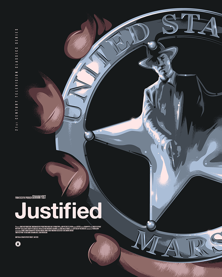
“JUSTIFIED”… is the story of Deputy U.S. Marshal RAYLAN GIVENS (Timothy Olyphant), a true-blue hero and something of a throwback, given to wearing a Stetson and cowboy boots, carrying his sidearm in a hip holster – a weapon he only draws when he has to, and when he does, he shoots to kill, because, as he sees it, that’s the purpose of a gun.
Network: FX
Seasons: 6
Genre: Western, drama
This became a real troublesome show to approach from a design perspective. The obvious route is to focus on Raylan’s iconic hat, and believe me, I sketched a hundred ideas around that hat! I’d still like to tackle a more ‘scenic’ or character-based direction with this show one day as it’s one of my favorites.
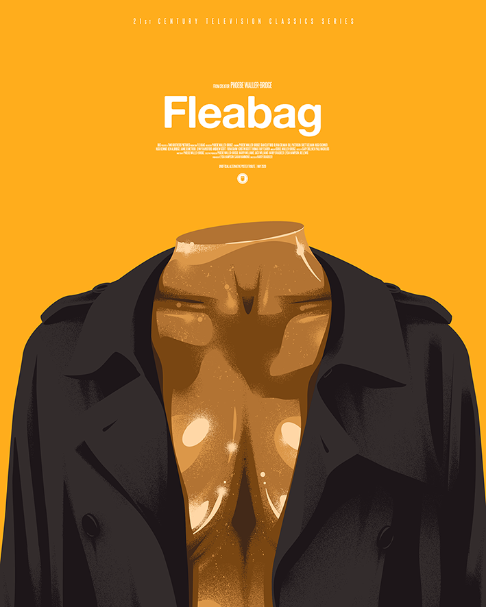
“FLEABAG”… A comedy series adapted from the award-winning play about a young woman trying to cope with life in London whilst coming to terms with a recent tragedy. A dry-witted woman, known only as Fleabag, has no filter as she navigates life and love in London while trying to cope with tragedy.
Network: BBC
Seasons: 2
Genre: comedy
As with my poster for Barry, I was conscious throughout this project of the lack of not just comedies, but also (criminally as a Brit) the lack of homegrown shows. I’d sketched ideas around some of my favourite more sitcom-style comedy shows (Spaced, Community, I’m Alan Partridge, Rick & Morty) but watching Fleabag for the first time during the lockdown it struck me early in season 2 that I was watching something special. The idea of combining the bronze statue with Fleabag’s iconic black trenchcoat was a real mid-episode Eureka moment – had to pause to leap up away from the screen to go scribble it down.
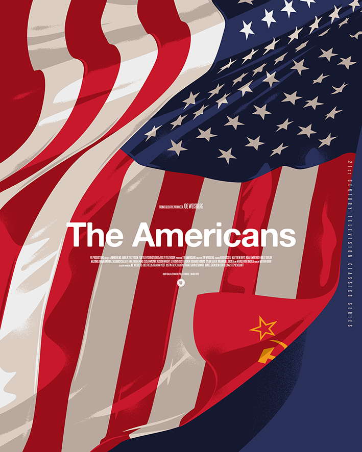
“THE AMERICANS”… is a period drama about the complex marriage of two KGB spies posing as Americans in suburban Washington D.C. during the Reagan administration.
Network: FX
Seasons: 6
Genre: spy thriller, period drama
My personal (unproven and hardly ground-breaking) theory with poster design is that people generally connect more if there is a human figure or character in it. Therefore, as much as I personally like the subtlety of an object or landscape being the focus of a poster, I’m still wary of that approach. The idea of a subtle nod to Russia hidden in plain sight in an American scene is something I may return to one day, but that principle applied to the US flag was a neat way of cleanly capturing the show’s concept.
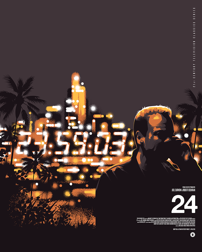
“24”… The show followed CTU (Counter Terrorist Unit) Agent Jack Bauer, played by Sutherland, as he thwarts multiple terrorist plots, including presidential assassination attempts, cyberattacks and thermonuclear detonations, as well as government and corporate corruption.
Network: Fox
Seasons: 8
Genre: crime thriller, action, espionage
This poster became an opportunity to incorporate a personal technique I’m a fan of using; night-time cityscapes with a bokeh, out-of-focus lights effect – an effect I’ve had to develop and tailor to my own way of working from piece to piece. I work 100% in vector and have restricted myself to solid blocks of color, so creating the impression of blended, out-of-focus or blurred elements has been a challenging effect to achieve within these limitations. Here, I was trying to find a way of subtly incorporating the famous 24 digital clock, so the majority of time spent on this design was experimenting on the right level of detail to show enough of the numbers to make them recognizable but for them still feel hidden within and part of the city lights.
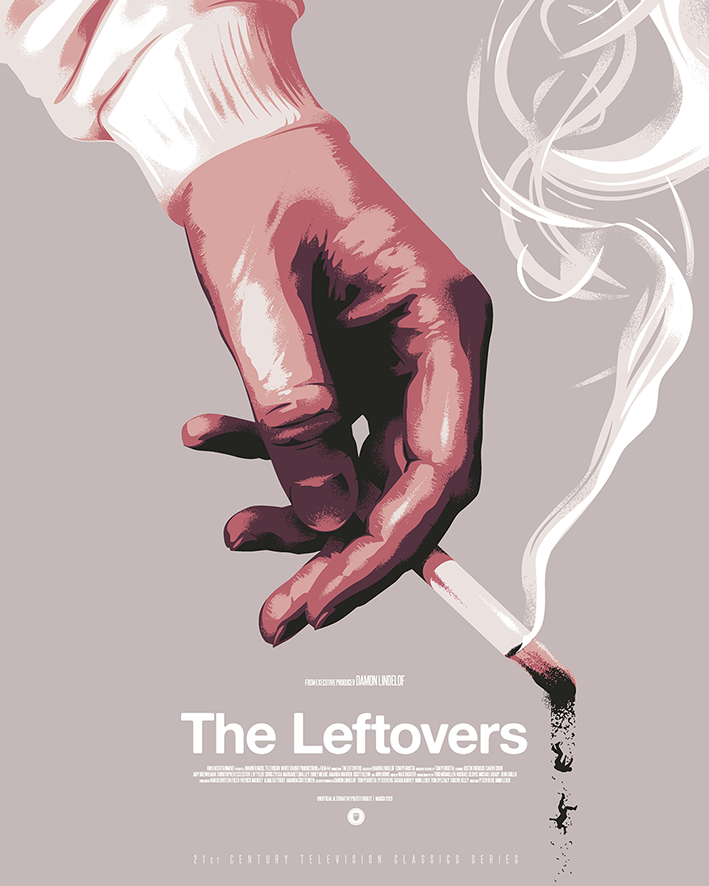
“The Leftovers”… After two percent of the world’s population inexplicably vanishes, those left behind grapple with what’s next. Based on the novel by Tom Perrotta and co-created by Damon Lindelof (Lost).
Network: HBO
Seasons: 3
Genre: Drama, supernatural, psychological thriller
Possibly my favorite show of all time. This was first on the list and the first I started sketching ideas for. I was working on this one, with the rough sketches for The Americans and The Wire waiting in the wings, so I was attempting at this early stage to find a uniform look, feel and font treatment that would work along all titles in the series, in order to give it a cohesive feel. I kept the title treatment from poster to poster but as the project progressed, when it came to The Sopranos and Lost for example, I abandoned any thoughts of a uniform design style as I didn’t want it to dictate or compromise the ideas.
A message from Damon Lindelof responding to this poster with ‘this has made my day” is my personal highlight of these strange few months.
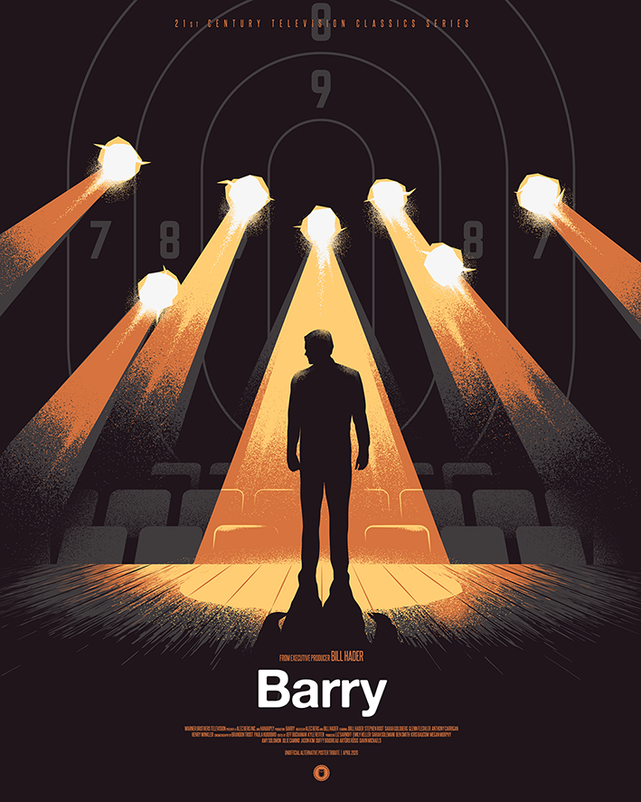
“Barry” … Barry is a dark comedy starring Bill Hader as a depressed, low-rent hitman from the Midwest. Lonely and dissatisfied in his life, he reluctantly travels to Los Angeles to execute a hit on an aspiring actor. Barry follows his “mark” into an acting class and ends up finding an accepting community in a group of eager hopefuls within the LA theater scene. He wants to start a new life as an actor, but his criminal past won’t let him walk away —can he find a way to balance both worlds?
Network: HBO
Seasons: 2
Genre: Dark comedy
I was conscious at this stage of the project (5 posters in) that as such a huge fan of comedy and sitcoms, I hadn’t actually included any! It was all looking very prestige drama-heavy… One of the reasons for that is that comedies – particularly sitcoms – were proving to be tricky as, by their nature, other than the general conceit, often have a constantly shifting narrative and focus, episode to episode, making it harder to pin down the heart of the show. Barry (as well as being fantastic) became the first comedy for me to take on as it has a serialized drama set-up with a unique hook of a premise; a hitman that wants to be an actor – so it very helpfully had already given me two juxtaposing elements to work with!
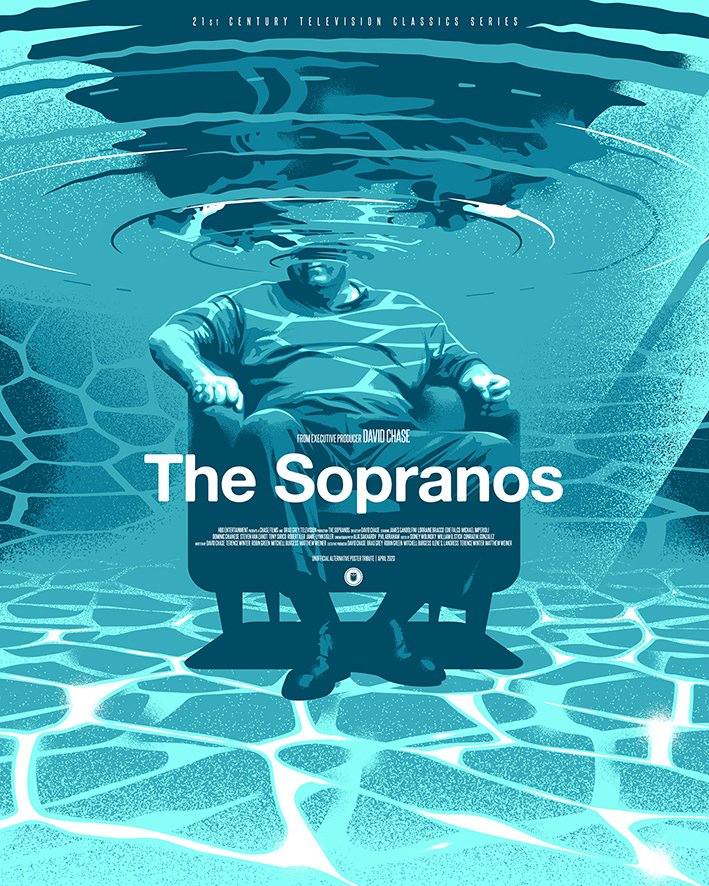
“The Sopranos”… Hailed as one of television’s essential dramas, The Sopranos follows James Gandolfini as Tony Soprano: husband, father and mob boss whose professional and private strains land him in the office of his therapist. Created by David Chase.
Network: HBO
Seasons: 6
Genre: crime drama
A common misunderstanding of this show is that it’s a Goodfellas-esque glamorization of a ‘cool’, desirable lifestyle, rather than an examination of the fragility of masculinity and the American Dream. With that in mind, I wanted to not focus on the ‘gangster’ elements – no guys in suits, no guns – like other posters have, and instead focus on the heart of the show which was Tony’s mental health issues.
An iconic scene that came to mind was Tony jumping in his backyard pool with the ducks. I liked the idea of viewing Tony from under the water, the ripples obscuring and distorting his head, which become a representation of his depression. My first sketch featured Tony in the pool in his classic robe and boxer shorts get-up, holding a cigar and a newspaper, but then I figured the robe would in reality just float up and sit on the surface… so instead I sat him fully-clothed in Dr. Melfi’s psychiatry chair. This lent the scene a more surreal feel, which felt appropriate as the show often incorporated weird dream sequences, and tied it back in to the themes of mental health.
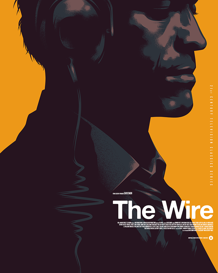
“The Wire“… In the drug-ridden streets of West Baltimore, there are good guys and there are bad guys. Sometimes you need more than a badge to tell them apart.
Network: HBO
Seasons: 5
Genre: Crime Drama
Looking back, I find the ‘headphone-cable-as-frequency-wave’ gag perhaps a little cheesy… but I was encouraged by the portrait element of McNulty. At the very least, this project has given me the opportunity to try out new techniques, and the way I now approach portraits has shifted thanks to this piece.
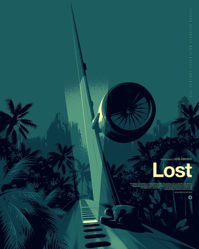
“Lost”… Oceanic Air flight 815 tore apart in mid-air and crashed on a Pacific island, leaving 48 passengers alive and stranded on a remote island in the South Pacific. The survivors include a diverse group of people from different walks of life — a doctor, an escaped fugitive, a con man, an Iraqi interrogator, a married Korean couple and a man formerly confined to a wheelchair who is now inexplicably healed. As the castaways attempt to get home, flashbacks (and forwards) illuminate their troubled lives before and after the crash, as the island they find themselves stranded on begins to slowly reveal its mysterious nature. Faith, reason, destiny and free will all clash as the island offers opportunities for both corruption and redemption… but as to its true purpose? That’s the greatest mystery of all.
Network: ABC
Seasons: 6
Genre: Sci-fi, supernatural, mystery
Working through this project, or a long time I kept avoiding sketching ideas for Lost. It’s a massively well-loved show (not least by myself), and while that’s perhaps not represented in terms of actual ‘posters’, there is an awful lot of ‘fan art’ out there… so I only wanted to tackle it if I felt I could find a unique spin on it.
I usually have one of two approaches when it comes to my illustrations. The first is to create a ‘scene’ that I hope is the best interpretation of the key themes of whatever I’m illustrating. The second is to try something a little cute and take two elements that are synonymous with the subject and combine them in a surprising way. I was thinking of the key imagery of the show, and the plane is the obvious one… but I wanted to do something odd, something typically Lost with it. The plane idea reminded me of Matthew Woodson’s amazing alternative poster for the film Her which features a huge plane balanced on its nose in the middle of a city. It’s such a surreal, arresting image that it made me wonder what I could also do with a plane that would be equally as strange and unexpected. I took myself on an imaginary tour of the inside and outside of a Boeing 757, trying to find recognizable elements but viewed from the perspective of what was iconic and memorable about Lost. When I came to the passenger windows, I was suddenly struck by the design similarities to the infamous hatch from season 1 and thought I could be on to something…
So, what are YOUR favorite TV shows? Which ones would you like to see added to the list? Seinfeld? I Love Lucy? Green Acres? Happy Days?…. sound off and let us know.

